Multichannel visual identity
Multichannel Visual Identity: The Guide to Adapting Your Logo and Brand Guide Across Every Channel in 2026
 MajoliÉquipe de Majoli.io
A consistent visual identity across every channel can boost brand recognition by 80% (Marq, 2025). Formats, sizes, mistakes to avoid: the complete method for adapting your logo and brand guide in 2026.
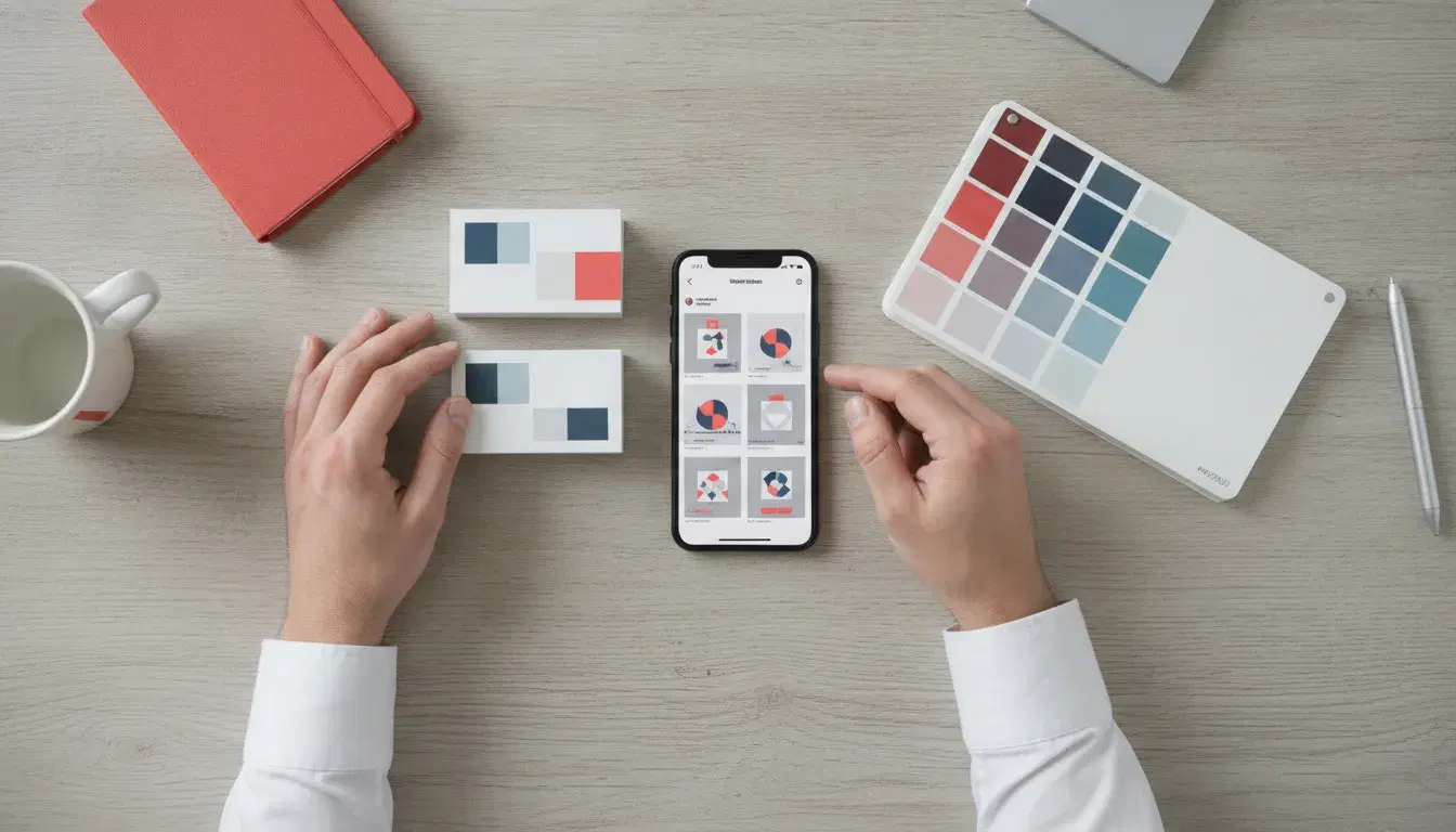
A logo that looks sharp on a business card can turn unreadable as an Instagram avatar, and a color palette that looks perfect on screen can turn dull once printed. This mismatch is not a cosmetic detail: a brand that stays consistent across every touchpoint gains up to 80% more recognition from its audience (Marq, 2025). A poorly adapted visual identity, on the other hand, can undo months of branding work the moment the first badly cropped LinkedIn post goes live.
For a small or mid-sized business, the goal is not to own a nice logo, it is to have a visual identity that is genuinely adaptable, one that can flex across a website, five social networks and printed materials without losing readability or recognizability. Here is the complete method, with the precise formats to know and the mistakes that do the most damage.
Why multichannel visual consistency matters in 2026
The average consumer is exposed to several thousand advertising messages a day. In that constant noise, repeating the same visual universe (the same colors, the same typography, the same logo proportions) is what allows a brand to stay identifiable in a split second. According to Adobe (2026), companies with a clearly documented brand guide applied consistently across every channel increase audience recall of their identity by 33%, and gain an average of 23% in internal creative productivity, because teams no longer start from scratch for every new material.
The impact goes beyond brand image. A consistent user experience across all channels (website, social media, email, print) improves the perceived quality reported by visitors by 40%, a factor that directly affects conversion and the trust granted to a small business competing against better-established rivals.
This topic has already been covered from the angle of colors and typography: if your brand color choices or your brand typography are not yet locked in, those are the prerequisites to settle before thinking about adaptation.
What a truly adaptable visual identity needs to include
A single logo, designed for a single use, is no longer enough. A solid visual identity should provide, from the moment it is created, a real kit of ready-to-use versions:
- The primary logo, in horizontal and vertical versions, to fit wide formats (website headers) as well as square or narrow ones (social media, packaging).
- A monochrome version and a reversed (negative) version (white on a dark background), essential whenever a medium cannot reproduce the original colors: fax, stamps, engraving, dark photo backgrounds.
- A standalone icon or symbol, without the company name, for tiny formats: favicon, avatar, app icon.
- A clear space rule (minimum space around the logo) and a minimum legible size, typically defined in pixels or millimeters, to keep it from being crowded out by other elements.
This list echoes the fundamentals covered in our complete brand kit checklist: without these basic building blocks, every new printed or published material becomes a graphic patch-up job rather than a simple adaptation.
Adapting your logo and brand guide by channel: the format table
Website
On the web, the logo should exist as a vector file (SVG) to stay crisp on every screen, including high-density (Retina) displays. Plan for a header version (usually 150 to 250 pixels wide), a compact version for the collapsed mobile menu, and a favicon exported at several sizes (16x16, 32x32 and 180x180 pixels for Apple devices). Colors should be calibrated in RGB / sRGB, the color mode used by screens, distinct from the mode used for print.
Social media
Each platform imposes its own cropping constraints. As a reference point for 2026:
- Instagram: square avatar (320 x 320 px minimum), square posts (1080 x 1080 px) or vertical posts (1080 x 1350 px), stories at 1080 x 1920 px.
- LinkedIn: page profile picture (300 x 300 px), cover banner (1128 x 191 px), post visuals (1200 x 627 px).
- Facebook: avatar (170 x 170 px), cover photo (820 x 312 px on desktop, automatically cropped on mobile).
The common thread across all these platforms: the standalone icon (without text) needs to stay legible as an avatar, because a logo built around the full company name often becomes unreadable below 32 pixels wide. This is one of the most frequent weak points seen in small business visual identities that never planned for a simplified version from the start.
Unlike the web, printed materials (business cards, flyers, signage, packaging) require files in CMYK mode (cyan, magenta, yellow, black) and a minimum resolution of 300 dpi to avoid a pixelated result. Colors defined only in RGB often look duller once printed: the brand guide should therefore list, for each color, both its hex code (web) and its CMYK or Pantone equivalent (print) from the moment it is created.
The 6-step method for building a consistent adaptation
- Audit what already exists. Identify every material currently in circulation (website, social media, email signature, quotes, invoices, signage) and note the discrepancies in colors, sizes or logo versions being used.
- Define the master logo and its derived versions. Starting from the source file, produce the horizontal, vertical, monochrome, reversed and icon-only versions, each as a vector file.
- Build a ready-to-use file kit. Export each version in the formats needed (SVG and transparent PNG for digital, high-resolution CMYK PDF for print) and organize them by use case rather than by technical format, so the team can find what it needs.
- Document the rules and the restrictions. Clear space, minimum size, allowed or forbidden backgrounds, prohibited distortions: these rules need to be written down in the brand guide, not just kept in the head of whoever created it.
- Test on every real medium, not just on screen by zooming into the source file: print a sample, publish a test post privately, check how the avatar renders on mobile.
- Centralize the kit in a shared, accessible space for anyone who produces content for the business (cloud folder, brand management tool), to stop outdated logo versions from continuing to circulate.
The mistakes that break brand consistency
- Using the full logo (spelled-out name) as an avatar or favicon, unreadable below 32 pixels wide.
- Defining colors only in RGB, with no CMYK equivalent, which creates visible gaps between what appears on screen and what gets printed.
- Cropping the logo on the fly for every new format instead of using a dedicated version, which distorts proportions and crushes the clear space.
- Letting several logo versions circulate across the website, social media and sales documents, often because the latest update was never shared with the whole team.
- Forgetting to update older materials after a partial redesign: it is better to plan for this from the moment a logo redesign is decided, to avoid a new identity coexisting with the old one for months.
How much time to plan for, and who should handle it
Building a complete adaptation kit (logo versions, social media templates, print templates, documented rules) typically represents several days of design work, once the logo and the base brand guide have been validated. For a small business without an in-house designer, this step is most often handed to a design studio or a freelance designer able to deliver a complete kit rather than a single isolated logo file. The same criteria used to choose the right logo and brand guide provider apply here too: make sure multichannel adaptation is part of the service, not an option billed separately afterward.
A design studio or a team specialized in graphic design and templates can handle the entire kit, from the master logo to ready-to-publish templates for each social network, to guarantee consistency from the very first material published.
Frequently Asked Questions
How many logo versions do you actually need to create?
At least four: a horizontal version, a vertical (or stacked) version, a monochrome version and a standalone icon for small formats. A reversed (white) version usefully rounds out this base set for dark backgrounds.
Should colors be the same on the web and in print?
The hue should stay recognizable, but the technical codes differ: hex or RGB for screens, CMYK or Pantone for print. A complete brand guide lists both equivalents for each color from the moment it is created.
Does the logo format need to change across social networks?
Yes, the avatar is almost always square or round while post visuals vary (square, vertical, story). That is why a standalone icon, without text, is essential: it stays legible regardless of the cropping each platform imposes.
How do you stop old logo versions from continuing to circulate?
By centralizing the brand kit in a single shared space accessible to everyone who produces content (community manager, sales rep, printer), and by actively removing old files from working folders whenever an update is made.
Does a small business really need such a complete kit?
Yes, as soon as it is present on more than two channels (a website and one social network are enough). The cost of redoing visuals one at a time, channel after channel, quickly exceeds that of building an adaptation kit once and for all. Our team remains available to discuss your visual identity project and its multichannel rollout.
Read next
October 15, 2026
Visual Identity Audit: The 6-Step Method to Check If Your Logo and Brand Guidelines Still Work in 2026
103,645 trademarks were filed with France's INPI in 2025, up 14.1% in a year. Before a costly rebrand, the 6-step method to audit your logo, colors and brand guidelines and find out what really needs to change.
October 14, 2026
Website for Chartered Accountants: The Complete Guide to Attracting New Clients in 2026
21,611 chartered accountants and more than 19,000 firms operate in France (OEC). Key pages, online booking, local SEO and professional ethics: the complete guide to an accounting firm website that truly converts in 2026.
October 13, 2026
AI and Inventory Management for Small Businesses: How to Forecast Demand and Automate Replenishment in 2026
18% of French companies now use artificial intelligence (Insee). The 5-step method to forecast demand and automate replenishment, without an expensive ERP, for small businesses.