
Brand style guide typography
Choosing the Typography of Your Brand Style Guide: The Complete Guide
 MajoliÉquipe de Majoli.io
Two fonts are enough in 90 percent of cases, but choosing them correctly is another matter. Font families, hierarchy, accessibility, technical weight and licensing: the complete method for a consistent brand identity in 2026.
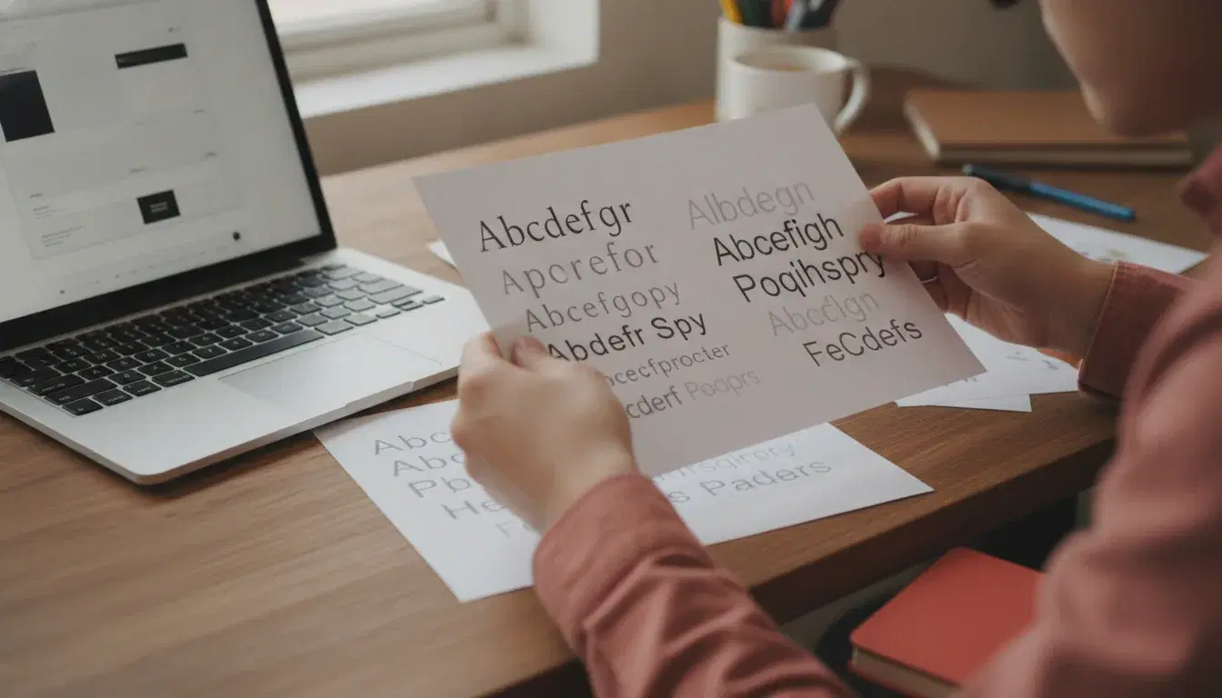
A brand style guide is often reduced to a logo and a color palette. Typography, meanwhile, is too often the poor relation of the project: a font gets picked because it "looks nice" in five minutes, with no method and no verification. Yet typography carries 90 percent of the content your customers actually read: your website, your emails, your quotes, your social media posts. Google Fonts now offers more than 1,200 free font families and powers close to 12 million websites worldwide (source: xp-numerique). Choosing the right typography, and above all using it correctly, has become a real lever of credibility for small and medium businesses.
This guide gives you a complete, data-backed and actionable method for choosing the typography of your brand style guide: from font families to technical performance, including accessibility and licensing.
Why typography is a pillar of your brand identity
Before a single word is even read, a typeface conveys an emotion: seriousness, modernity, warmth, luxury. It shapes the perception of your company just as much as your logo or your colors, and it appears on far more touchpoints than either of those: website headlines, buttons, invoices, email signatures, LinkedIn posts.
It is also a matter of pure readability, and therefore of conversion. According to a study cited by Smashing Magazine, increasing font size from 14 to 16 pixels improves reading comprehension by 8.5 percent and reduces reading time by 7 percent. On a showcase website or a sales page, a detail like this weighs directly on your conversion rate and on the time visitors spend reading.
The main font families and what they say
Before choosing, it helps to know the four major typographic families and the tone each one carries:
- Serif fonts: evoke seriousness, tradition and expertise. A good fit for an accounting firm, a notary, or a luxury brand.
- Sans-serif fonts: evoke modernity, simplicity and clarity. The safest choice for a website or an app.
- Script fonts: bring a human, personal touch, but quickly become hard to read in body text. Best reserved for logos, headlines or decorative accents.
- Display fonts: strong personality, useful for a headline or a logo, never for a full paragraph.
The 2026 trend observed by several branding agencies is a return of serif typefaces, bolder and designed with digital use in mind, as an alternative to the geometric sans-serif fonts that dominated the previous decade.
A six-step method for choosing your typography
1. Start from your brand positioning, not personal taste
The first mistake is choosing "what you like" rather than what matches the company's values. Before opening a font catalog, define three adjectives that describe your brand (rigorous, approachable, innovative, for example) and look for a typeface that visually embodies them.
2. Limit yourself to two font families
One font for headlines, another for body text: in 90 percent of cases, this combination is enough. Adding more families hurts consistency and unnecessarily increases page weight, since every extra font adds a request and file size to load. If you want variety, play with the weights (regular, medium, bold) of a single family instead.
3. Build a clear typographic hierarchy
A good hierarchy relies on three variables: size, weight and color. It guides the visitor's eye from the headline to the subheading and then to the body text, without requiring conscious effort. A line height between 1.4 and 1.6 times the font size offers the best reading comfort, up to 1.8 for long-form text.
4. Check readability and accessibility
An elegant but hard-to-read typeface ends up tiring visitors, or even excluding some of them. Always test the contrast between text and background (WCAG guidelines recommend a minimum ratio of 4.5:1 for body text) and avoid body text sizes below 14 pixels on the web, with the recommended range sitting between 14 and 19 pixels.
5. Plan for technical performance
A font is not just an aesthetic choice, it is also a file that has to load. A variable font can weigh between 200 and 500 KB, compared to about 30 KB for a classic static font, and every additional family adds its own weight to the page. The .woff2 format is now the standard, and a technique called subsetting (keeping only the characters actually used) can reduce a font's weight by more than 90 percent. Enabling font-display: swap also prevents text from staying invisible during loading, which directly affects performance metrics such as LCP.
6. Secure your usage licenses
Not every font is free to use commercially. Always check the license before deploying a typeface on your website, your printed materials or your social media: libraries like Google Fonts offer fonts under free-use licenses, but many independent foundries charge per use case (web, print, logo) or per number of monthly views.
Mistakes that damage a brand identity
- Using too many different fonts on the same medium, which breaks visual consistency.
- Using a script or display font in body text, which becomes unreadable beyond a few words.
- Ignoring mobile rendering: a thin or heavily condensed typeface can become illegible on small screens.
- Following a short-lived trend without checking it matches the company's identity over the long term.
- Not testing under real conditions: a font that looks "beautiful" on a mockup can behave poorly once placed in a menu, a button or a table.
Where to find and test your fonts
For web use, Google Fonts remains the most reliable resource: a free library, optimized for loading speed and already used by millions of websites, which guarantees consistent rendering across browsers. For more specific needs (a logo, premium printed materials), independent foundries and premium font marketplaces offer more distinctive options, provided you check the license carefully. In every case, always test your fonts "in context": in a headline, a button, a table and a long paragraph, before locking them into your brand style guide.
Consistent typography across every touchpoint
Once chosen, your typography needs to be documented precisely in your brand style guide: primary and fallback fonts, sizes, weights and their associated uses (headline, subheading, body text, button). This documentation ensures your website, printed materials and social media stay visually consistent, even when several people are involved in your communications. It is work our team systematically builds into the graphic design mockups we create for clients, so the visual identity holds together from the logo all the way to the last page of the site.
If your company already has a brand style guide but typography has never been thought through as a coherent system, a design studio engagement can often clarify usage without rebuilding everything from scratch.
A strong visual identity is never judged on a single screen: it needs to stay readable and recognizable, from the logo down to the smallest button in a form.
Typography never works alone. It has to align with your brand colors, a topic we covered in detail in our article on choosing the colors of your brand style guide, and with the full set of elements that make up your visual identity. If you're starting from scratch, our guide to creating your logo and brand style guide covers the first steps before you even think about typography.
Finally, well-chosen typography only reaches its full potential when deployed on a platform built to showcase it: a website designed with the mobile-first approach that has become the standard in recent years. If you're still unsure which provider to trust with this work, our article on how to choose a company for your logo and brand style guide gives you a framework to evaluate them. For any question about your project, our team is reachable through the contact page.
Frequently asked questions
How many fonts should I use in a brand style guide?
Two font families are enough in the vast majority of cases: one for headlines, one for body text. You can enrich the palette by playing with the weights (light, regular, bold) of a single family rather than adding a third font, which preserves visual consistency and keeps the site's technical weight in check.
What font size should I choose for a website?
A size between 14 and 19 pixels for body text offers the best balance between readability and information density. Going from 14 to 16 pixels measurably improves reading comprehension, a gain that is especially useful on pages meant to persuade, such as a services page or a contact form.
Should I use Google Fonts or a paid font?
Google Fonts suits the vast majority of small and medium businesses: the library is free, optimized for the web and broadly compatible with every browser. A paid font can be justified for a logo or a premium identity seeking strong differentiation, provided you check the license terms carefully before any commercial deployment.
How do I check that a font is accessible?
Check the contrast ratio between text and background (a minimum of 4.5:1 is recommended for body text under WCAG standards), avoid body text that is too small or too condensed, and test reading on mobile as much as on desktop. An accessible font benefits every visitor, not only those with a visual impairment.
Does typography affect SEO?
Indirectly, yes: a poorly optimized font increases page load time, a factor Google takes into account when evaluating user experience. Using a modern format like .woff2, limiting the number of font families loaded and enabling asynchronous font loading therefore also contributes to your website's SEO performance.
Read next

September 30, 2026
Automating Electronic Signature and Document Management for SMEs: The Complete 2026 Method
26% of small businesses now use electronic signature (Yousign/Ipsos, 2025), up from 19% in 2021. The complete method to automate signature and document management without losing compliance.

September 29, 2026
AI for Small Businesses: Automating Quotes and Payment Reminders to Get Paid Faster in 2026
26% of French SMEs use AI in 2025, up from 13% in 2024 (France Num). The 5-step method to automate quotes and payment reminders with AI and cut payment delays in 2026.

September 28, 2026
Marketing Automation for Small Businesses: How to Convert Prospects Without Spending Your Days on It in 2026
79% of marketing leads never buy due to lack of follow-up (Forceplus). A 5-scenario method to automate prospecting and convert more, without the daily grind, in 2026.